Let’s get in touch! Email me using the form below.


Van Cleef & Arpels is a French luxury jewelry company. A Brand
Founded on Love. It was founded in 1896 by the Dutch diamond-cutter Alfred Van Cleef and his father-in-law Salomon Arpels in Paris.


Van Cleef & Arpels is a French
luxury jewelry company. A Brand Founded on Love. It was founded in 1896 by the Dutch diamond-cutter Alfred Van Cleef and his father-in-law Salomon Arpels in Paris.
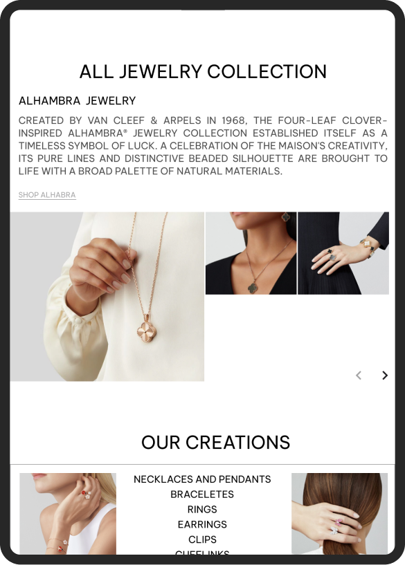
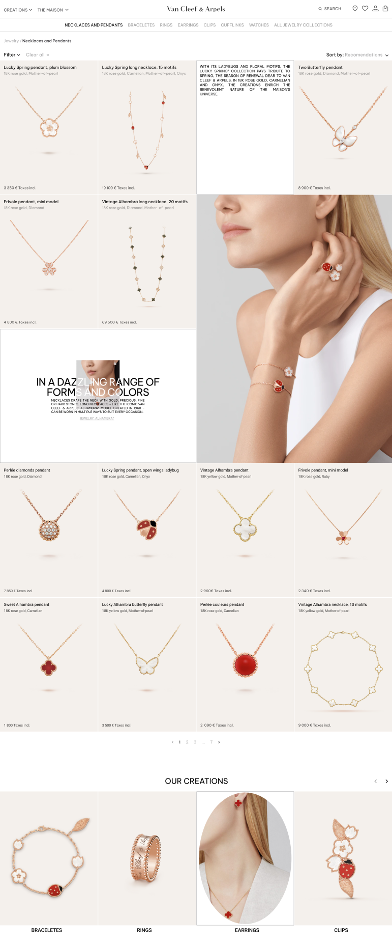
I have used a 4-column grid, which is especially relevant for the catalog. It also allows us to show much more product positions. The page turned out to be light, stylish and elegant. There are no bright colorful palettes here, as I worked to emphasize the delicacy of the jewelry.
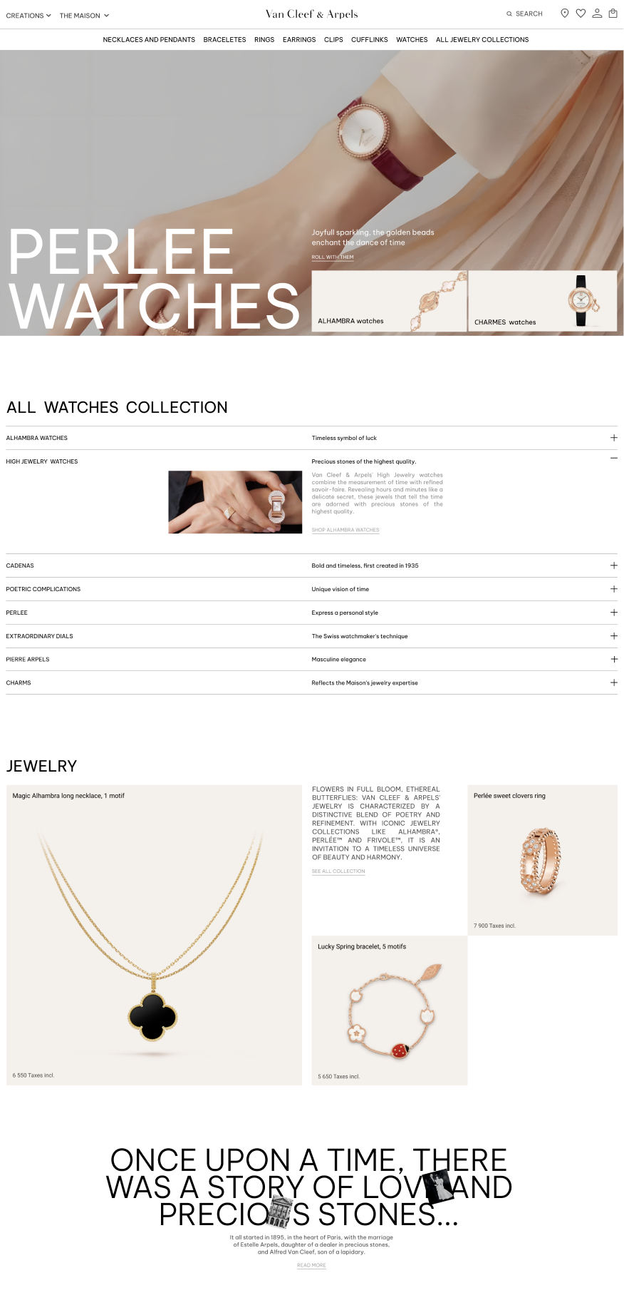
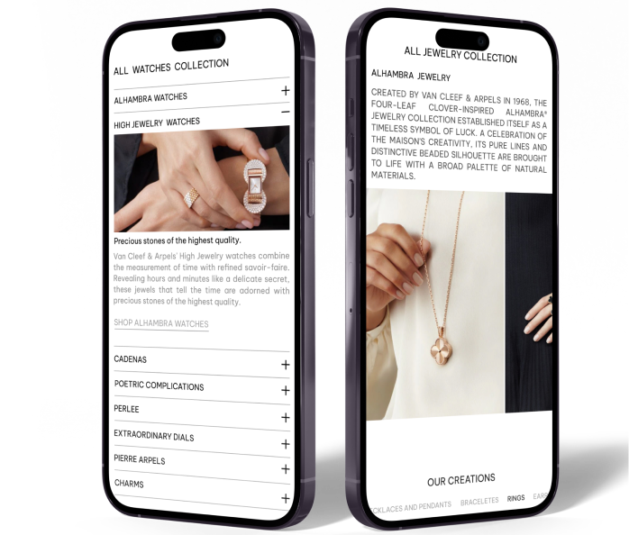
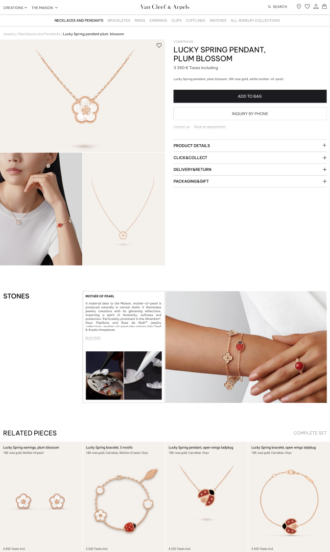
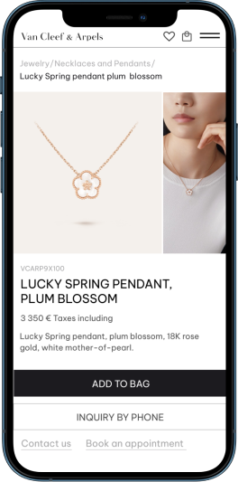
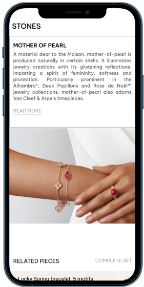
The existing web page was interesting with animation, however it had a typical design with big photo content. I have decided to create a pleasant visual look and delightful feeling for the brand, to make users admire jewelry, and encourage their interests.

I have used a 4-column grid, which is especially relevant for the catalog. It also allows us to show much more product positions. The page turned out to be light, stylish and elegant. There are no bright colorful palettes here, as I worked to emphasize the delicacy of the jewelry.


I have createв a pleasant visual look and delightful feeling for brand, to make users admire jewelries, and encourage their interests.
The page turned out to be light, stylish and elegant. There are no bright colorful palettes here, as I worked to emphasize the delicacy of the jewelry.
